After months of tedious tweaking, Minnesota finally has a new flag worthy of this great state. It will be presented to the Legislature in 2024, and barring a veto, it will fly on Statehood Day, May 11, 2024. And I can’t wait.
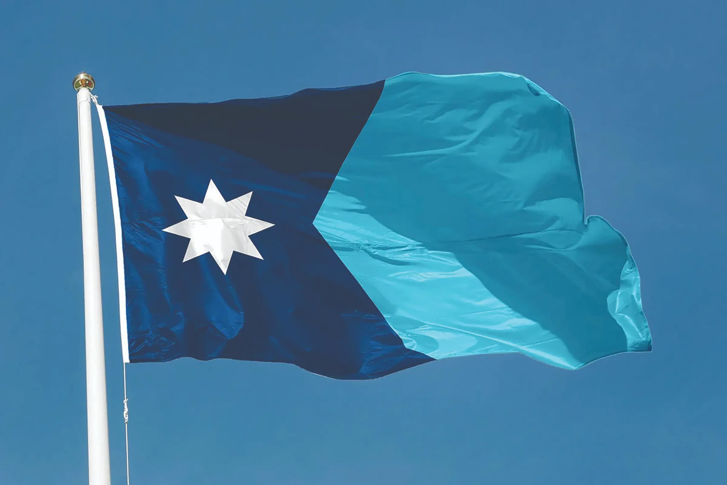
I’m one of the zealots who’s followed every step of the process and I can assure you that we’ve ended up with an “A+” design — a white multicultural eight-point “north star,” also reflected on the center of the floor of the Capitol rotunda, over a dark blue swallowtail representing the shape of Minnesota next to a brilliant sky-tinted blue that represents the many waters that unite us as Minnesotans from the Mississippi to Lake Superior to the 10,000+ other lakes, streams and rivers that grace our state.
Its simple and symmetrical design is lauded by experts as a worst-to-first design turnaround, like the class clown becoming valedictorian overnight.
According to a Star Tribune article on Dec. 20, flag expert Ted Kaye “gave Minnesota's new design an "A" and called it excellent.”
“‘You can't make everybody happy, but Minnesota will come to be extremely proud of this flag,’ said Kaye, secretary of the North American Vexillological Association. ‘The state has seized a wonderful opportunity to improve its symbolism.’”
Yes, I’m a nerd.
For years I have worked with a dedicated team of volunteers on a Facebook page called “Minnesotans for a better flag” (lowercase, not upper as that’s another group) with other amateur flag designers dreaming up more inclusive representations of Minnesota.
In October 2020 I wrote a piece for the Hill & Lake Press calling for a new flag and seal to replace what I considered to be a racist and offensive symbol of 19th century white supremacy, colonialism and the displacement and genocide of native people.
In that time, I’ve learned a lot about vexillology (the study of flags) and the principles of good flag design according to “‘Good’ Flag, ‘Bad Flag,” by Ted Kaye:
- “Keep it simple: the flag should be so simple that a child can draw it from memory;
- Use meaningful symbolism: the flag's images, colors and patterns should relate to what it symbolizes;
- Use two or three basic colors;
- No lettering or seals;
- Be distinctive or be related.”
The current flag fails miserably at meeting these criteria and was recently described as “a cluttered genocidal mess” by State Rep. Mike Freiberg, the author of the bill to replace it.
In contrast, the proposed flag would elevate Minnesota to the top tier of U.S. state flags and be a unifying symbol for all Minnesotans to be proud of.
Why do I care?
Perhaps I was more sensitive to this issue because I’m Native Hawaiian — as in my Polynesian ancestors crossed the Pacific ocean millennia ago and settled in Hawaii as its original human inhabitants.
As with North America, Europeans arrived in Hawaii with germs that killed off the vast majority of my people. Some of these Europeans are also my ancestors. In the wake of this catastrophe, Europeans came to hegemonically dominate Hawaiian institutions, eventually overthrowing our monarchy and annexing Hawaii, first as a U.S. territory and later as a state. Sound familiar?
Hawaii’s flag, a merger of the Union Jack and the U.S. flag, was designed to appease both sides of the colonial interests in an at- tempt by the Hawaiian monarchy to maintain independence. It’s a 19th century colonial symbol that is distasteful but not disgusting.
In contrast, Minnesota ended up with a racist seal on a flag depicting a white settler on his recently tilled land that he protects with a gun, seen leaning against a nearby tree stump, while a half-naked generic Indian man rides bareback on a horse into the sunset (aka, the Dakotas) adorned with a feather right out of a Land-O-Lakes ad. The Minnesota seal and flag is a sordid and repugnant cartoon depicting manifest destiny and white supremacy.
According to the Star Tribune on Dec. 28: “...real meaning of the (current) flag is conveyed in a poem by Mary Eastman, wife of Seth Eastman, whose drawing inspired the seal. The poem begins with ‘Give way, young warrior, thou and thy steed give way,’ before proclaiming that the settlers have taken control of the land. ‘The white man claims them now,’ the poem later states.”
Like many Minnesotans, I contacted state representatives, including Senator Scott Dibble, to right this wrong by developing a new flag and seal. He agreed, and along with other legislators, supported and advocated for the change.
In 2023 the legislature created a State Emblems Redesign Commission with a mandate to develop a new flag and seal.
Remarkably, “design-by-committee” actually worked, and Minnesota won big!
The State Emblems Redesign Commission was democracy at its messiest in its “design-by-committee” approach, but in the end, they came through with a showstopping design, renewing my faith in the process.
Diversity was built into the selection process with various cultural groups represented along with state leaders, such as Secretary of State Steve Simon.
The Dakota and Ojibwe representatives were the most vocal and persistent voices on the commission and most commissioners appeared to actively listen and learn from each other and professional vexillologists.
But the person who deserves the most credit is its chair, Luis Fitch, an “internationally renowned Mexican artist, mentor, and creative entrepreneur, specializing in fine art and working across gallery and urban art settings,” as described by his website, luisfitch.com.
Luis did a masterful job managing strong personalities through a complex process and aesthetic minefield. He found the right tone and language to unite the commission, which ultimately approved the design 11-1, with one commissioner holding out for additional green and white stripes.
David Kelliher and his staff at the Minnesota Historical Society also deserve kudos for professionally and efficiently administering the design competition and commission.
What’s next?
No matter what you think of the final product, the process is one to be proud of.
People from a wide range of perspectives spent hours together, engaged in respectful and constructive conversations about how to represent the best of Minnesota.
Unless the legislature vetoes it with a two-thirds majority vote, both the proposed flag and seal will become our newest state emblems this spring. It’s been a long time coming, but it’s well worth the wait.
Our state leaders deserve our gratitude for taking a stand and correcting this injustice with a beautiful, enduring and unifying icon.